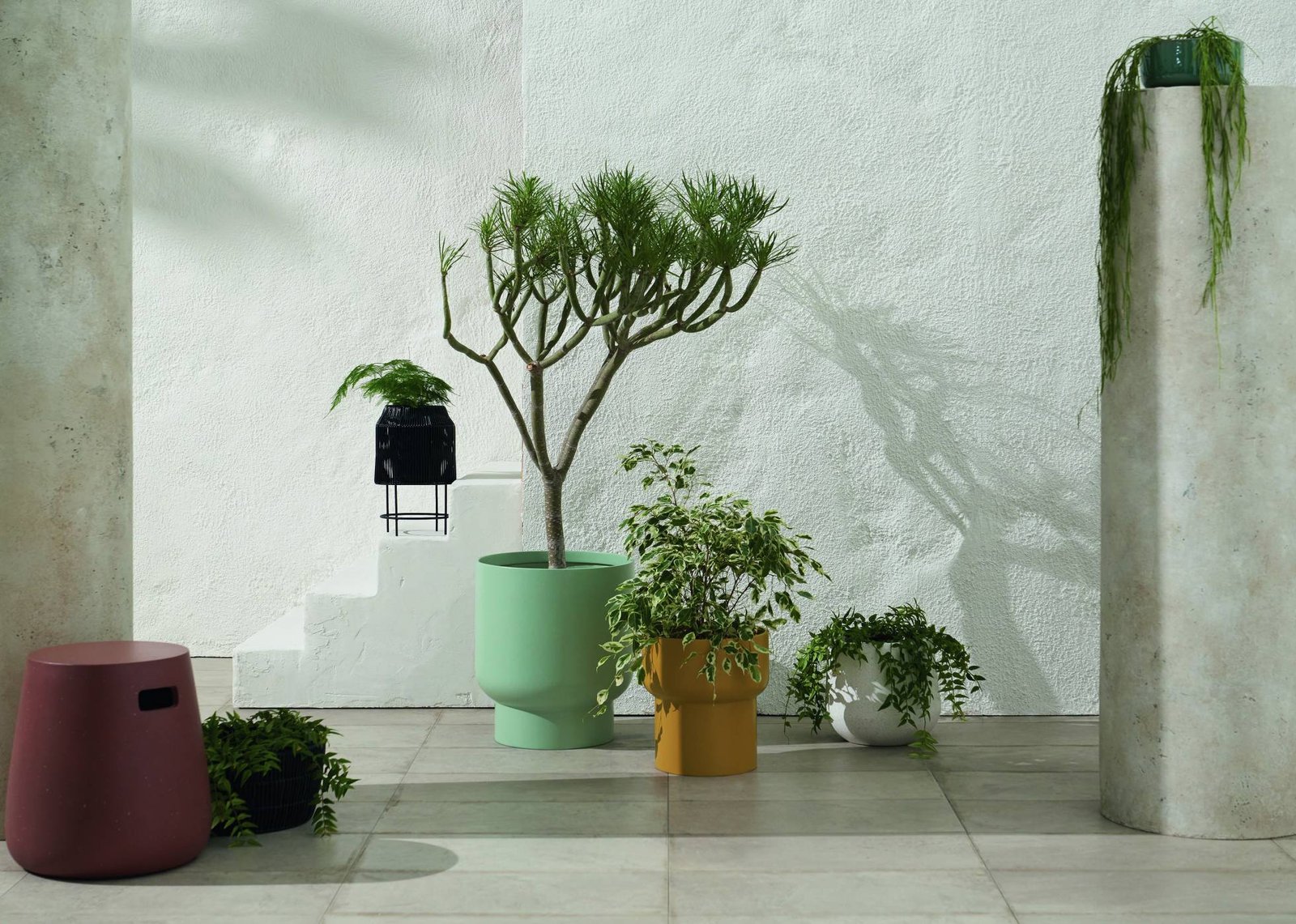
A decorative pot should do two jobs at once: support the plant and strengthen the room around it. The best design pots are not simply attractive objects - they balance scale, material, color, drainage and everyday practicality.
Plant styling works best when the container feels intentional. A planter that is too small can make a mature plant look top-heavy. A glossy statement pot in an already busy room can fight for attention. A beautiful vessel without a drainage plan can turn routine watering into a weekly problem.
This guide treats plant pots as part of interior design without forgetting that they are still part of a living growing system.
Start with the plant, then design the pot around it
The container should respond to the plant's needs before it responds to the room. Check the root volume, growth habit, watering pattern and drainage requirements first. Then choose the visual language.
If you are not sure where to start, Find My Pot helps narrow the container type by plant, location and care priority before you think about style.
Scale is the first design decision
A pot that feels "wrong" is often a scale problem rather than a color problem.
Small plants need visual breathing room
Compact plants can disappear inside oversized floor planters. For shelves, desks and side tables, the container should feel proportionate to both the plant and the furniture surface. A small peperomia in a huge decorative bowl usually looks accidental rather than luxurious.
Large plants need enough visual weight
Ficus, large palms, monsteras and similar architectural plants often need a planter with enough mass to anchor them visually. A tall plant in a narrow, lightweight-looking pot can feel unstable even when it is physically secure.
Groupings need hierarchy
When styling several pots together, avoid lining up identical heights. A more natural composition usually has one dominant plant, one medium supporting plant and one smaller accent. Repeating one material or color across the group creates cohesion without making every pot identical.
Choose material for both mood and behavior
Terracotta
Terracotta brings warmth, texture and a Mediterranean or craft-led feeling. Its porous body can allow moisture to move through the container wall, which often means potting media dries faster than it would in a non-porous glazed pot. That can be useful for plants that dislike staying wet, but it also means more frequent watering in hot or dry environments.
Glazed ceramic
Glazed ceramic can feel polished, colorful or sculptural. The glaze reduces porosity, so moisture loss through the container wall is lower than in unglazed terracotta. For interior spaces, ceramic is one of the easiest materials to coordinate with furniture, tile and textiles.
Stone and stone-look composites
Real stone can be beautiful but heavy. High-quality composites can create a similar visual effect at lower weight, which matters when a large plant needs to be moved for cleaning or light.
Metal
Metal planters can look crisp and architectural, but direct sun can heat the container rapidly outdoors. Many indoor metal planters work best as cachepots with a draining inner nursery pot rather than as the plant's direct growing container.
Wood
Wood adds warmth and works especially well in natural, Scandinavian and contemporary interiors. For direct planting, construction and moisture protection matter. A wooden outer planter with a removable inner pot is often easier to live with indoors.
Plastic and resin
Good plastic or resin planters are lightweight, practical and available in refined finishes. They are especially useful where weight matters - upper floors, shelves, balconies or very large planters. The challenge is visual quality: thin, shiny plastic can read as temporary, while thicker matte finishes often integrate more convincingly into a designed room.
Color: use the room, not the trend, as your reference
There are three reliable approaches to planter color.
1. Quiet continuity
Choose a pot close to the wall, floor or furniture palette. This makes the foliage the visual focus. Warm ivory, stone, soft gray, sand and muted earth tones are especially effective when the plant itself has dramatic leaves.
2. Controlled contrast
Use a pot as one deliberate accent. Terracotta against a pale interior, deep green against warm wood or black against a minimalist room can create a strong focal point without requiring a bright color.
3. Repetition
Repeat a color already present elsewhere in the room - a cushion, artwork, tile or small accessory. The planter then feels connected rather than added later.
Avoid matching every pot exactly. A room can feel more sophisticated when the palette repeats but the forms vary.
Shape changes the character of the space
- Cylinders: quiet, modern and easy to group.
- Tapered pots: visually lighter and practical for many floor plants.
- Bowls: low, broad and useful for shallow compositions or groups of compatible plants.
- Pedestal planters: add height without requiring a taller plant.
- Ribbed or fluted pots: add texture while staying within a neutral palette.
- Organic irregular forms: bring a handmade, softer feeling but should be used selectively.
Drainage can be invisible - but it cannot be ignored
The Royal Horticultural Society emphasizes the importance of drainage in container growing. Indoors, however, many of the most attractive decorative planters do not have holes because homeowners do not want water on floors or furniture.
The solution is often a cachepot system:
- Keep the plant in a draining inner pot.
- Place that pot inside the decorative outer container.
- Remove the inner pot for thorough watering when practical.
- Allow excess water to drain before returning it.
- Check that water is not collecting unnoticed in the outer vessel.
This approach separates horticultural performance from interior design and makes it easier to change the outer pot later.
How to style pots room by room
Living room
Use one larger architectural plant as an anchor rather than scattering many small pots across every surface. A floor planter can connect visually with a sofa, console or window corner and create a stronger composition with less clutter.
Bedroom
Keep the palette calm and maintenance low. One or two plants are often enough. Consider how far the pot is from the window and avoid containers that make watering awkward near textiles or wood furniture.
Kitchen
Small herbs or compact foliage plants can work well if light is adequate. Prioritize easy-to-clean surfaces and stable pots that will not be knocked over during daily use.
Bathroom
Humidity can suit certain tropical plants, but light still matters. A bathroom without natural daylight is not automatically a good plant environment. If you do have suitable light, glazed ceramic and stone-like finishes can integrate well with tile.
Home office
Compact plants such as peperomias work well on desks because they stay relatively small. Shelves and trailing plants can add greenery without consuming work surface.
Balcony or patio
Outdoor styling introduces wind, heat, drainage and weight. Tall narrow pots can be visually elegant but may be unstable in exposed locations. The RHS notes that larger containers dry out more slowly than small ones, while tall narrow containers can be prone to blowing over.
Use fewer, better planters
A room usually looks more intentional when it contains fewer, stronger containers rather than many unrelated pots. This also simplifies care. Group plants by light and watering requirements, then use design to create a visual family.
A useful formula is:
- one hero floor planter;
- one or two medium planters at different heights;
- a small accent plant where the room benefits from detail.
Design pots for small spaces
In apartments, every square foot matters. Look for:
- tall but narrow planters for unused corners;
- wall shelves for compact plants;
- hanging pots where ceiling structure allows safe installation;
- plant stands that create vertical hierarchy;
- lightweight materials where pots must be moved frequently.
For plant choices that suit limited space, see our guide to the best indoor plants for small apartments.
Common decorative planter mistakes
- Choosing the pot before measuring the plant's current nursery container.
- Ignoring the visual scale of the furniture around it.
- Using a sealed pot without a drainage strategy.
- Buying a heavy planter before deciding how it will be moved.
- Using too many unrelated colors and finishes in one room.
- Choosing a tall narrow outdoor planter in a windy exposed location.
- Assuming "natural" material automatically means low maintenance.
A designer's planter checklist
Before you buy a decorative pot, check:
- inner diameter and root-space requirement;
- drainage or cachepot plan;
- finished weight when filled;
- material behavior indoors or outdoors;
- visual proportion to the plant;
- visual proportion to furniture and room;
- color relationship to the existing palette;
- how easily you can water, clean and move it.
Frequently asked questions
Should all plant pots in a room match?
No. Repeating one or two materials, colors or shapes creates cohesion without making every container identical.
Can I plant directly into a decorative pot with no drainage hole?
It is usually easier and safer to use it as a cachepot with a draining inner container. If you plant directly into a sealed vessel, moisture management becomes much less forgiving.
Are large pots easier to care for?
Larger containers generally hold more growing medium and dry more slowly than small ones, but they are heavier and can remain wet too long if oversized for the root system.
What pot colors are easiest to design around?
Warm ivory, stone, muted gray, terracotta, natural wood tones and deep greens are versatile because they support foliage without competing with it.